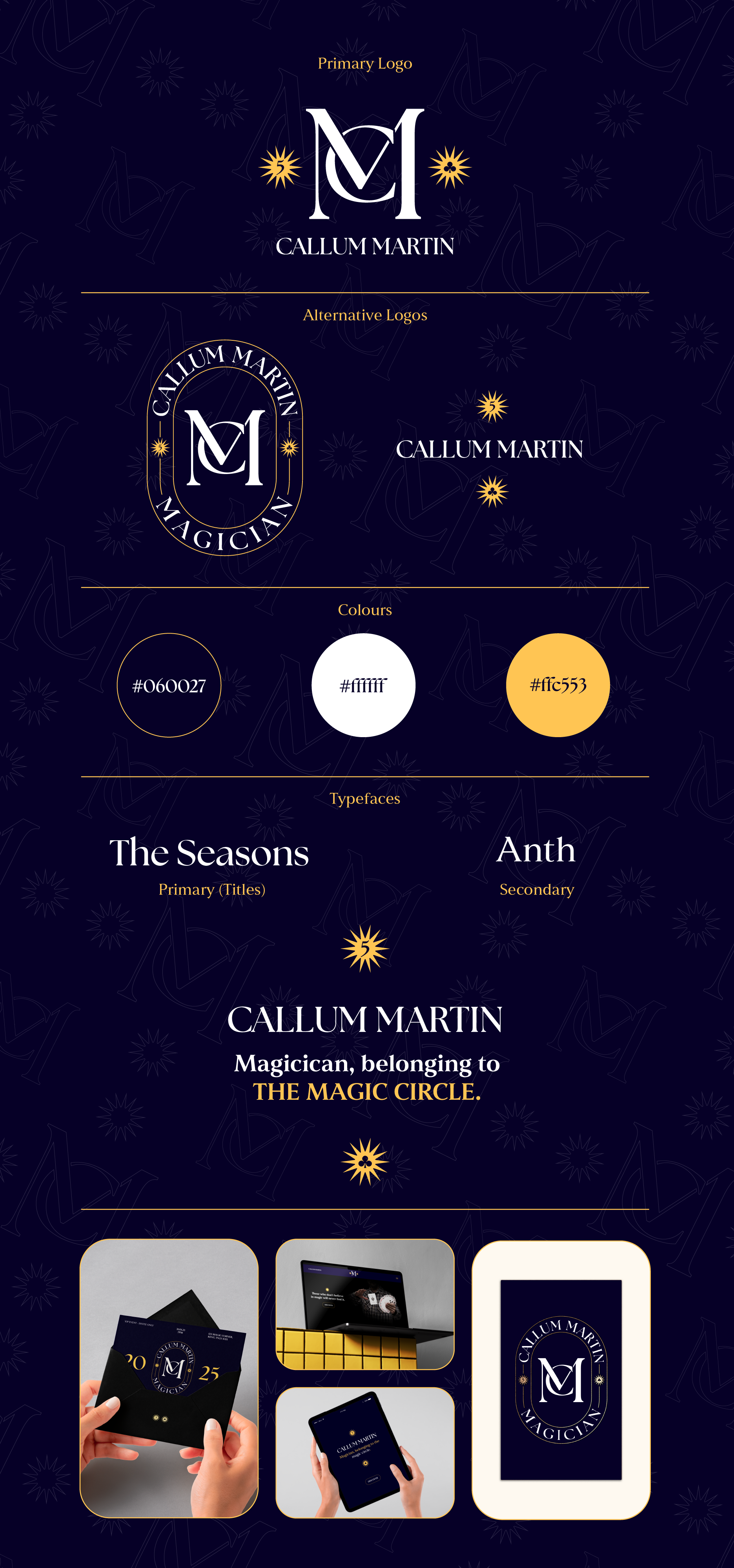
Callum martin magic rebrand
2025
As part of this project, I undertook a comprehensive rebrand for my brother, a member of the Magic Circle, whose existing branding did not effectively represent his skills and level as a professional magician. The goal was to enhance his public image, establish a distinct identity, and elevate his positioning within the competitive landscape of the magic community.
I developed a new logo that reflects the mystery and allure of magic while remaining sophisticated and professional. The color palette was chosen to create a sense of intrigue, featuring deep blues and golds that convey elegance and authority. This new visual identity was applied consistently across collateral, including business cards, promotional materials, and digital platforms.